Responsive images and Media
Drupal's Media is a powerful tool and we will use it to improve the way we manage responsive images by using media types and view modes to our advantage when managing responsive images. The following quote comes straight from Drupal's Media module:
In Drupal, the core Media module manages the creation, editing, deletion, settings, and display of media entities. Media items are typically images, documents, slideshows, YouTube videos, tweets, Instagram photos, etc. Media entities are standard Drupal content entities. And are grouped by Media type bundles. Like content types they can have fields added, and their display can be managed via view modes.
Media in Drupal
Out of the box, Drupal ships with the following media types: Audio, Document, Image, Remote video, and Video. You can create new media types if needed. For example, you could create a new media type that is of type "Image". Why would you do this? Well, in some cases, you may have specific requirements to handle images of a particular entity and rather than modify the existing Image media type, you could create a new one so you can manage specific settings on the new type and don't run the risk of breaking something on your site by updating the default Image media type. Creating new media types is outside the scope of this post, but wanted to let you know what's available to you.
- Let's start by enableing the Media and Media Library modules as these are not enabled by default
- Navigate to
/admin/structure/media - Since we'll be working with images, click the Edit link to the right of the Image media type
- We won't get into all the wonders of Media types, instead let's jump into Manage display
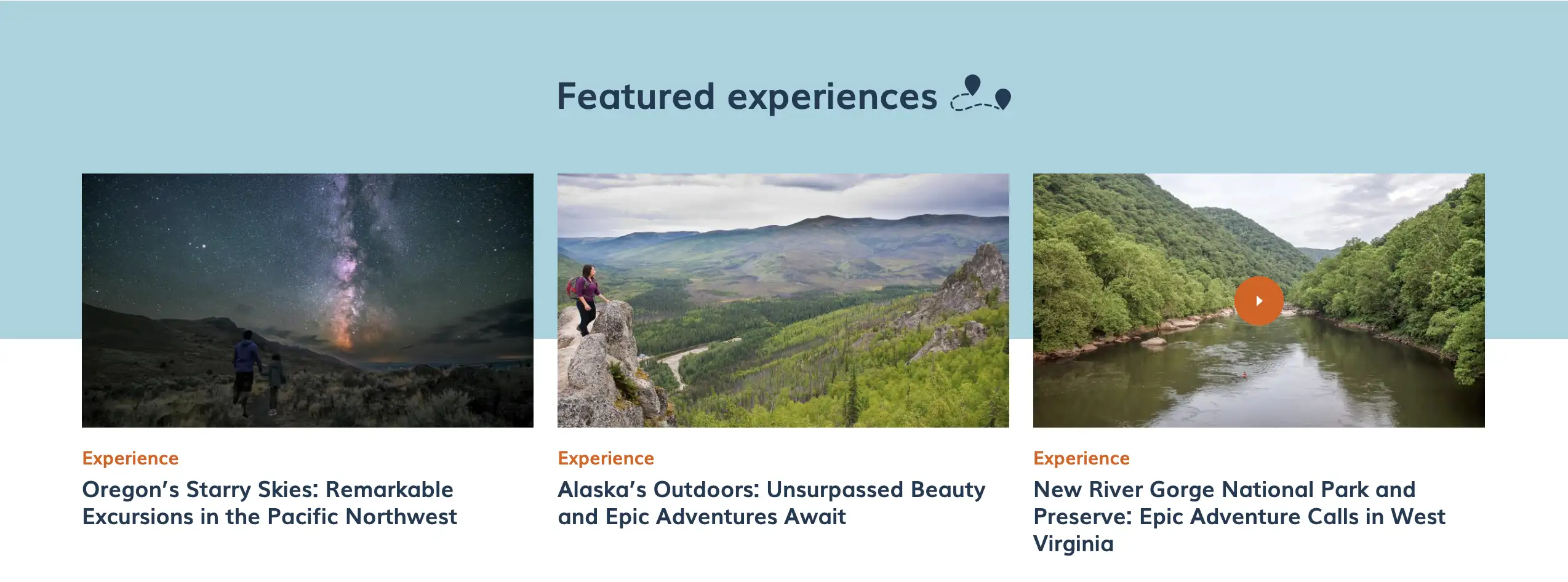
Like any other Drupal entity bundle, Manage displays, also known as View modes, are a pretty powerful feature. So what are view modes? View modes is how we display content in different ways. Take a look at the image below. Each of the numbered marks is a view mode. Same content, different ways and different fields.

Media view modes
Now that we understand how view modes work, we will use them to manage/display our responsive images. Let's start by creating a new Media view mode.
- Within the Manage display tab for the Image media type, scroll down and expand the Custom display settings fieldset
- Click Manage view modes
- In the View modes screen scroll down to the Media section and click Add new Media view mode
- Type News listing as the view mode name.
- Click Save
- Go back to the Image media type Manage display screen (/admin/structure/media/manage/image/display)
- Scroll down and expand the Custom display settings fieldset
- Check News listing and click Save. This enables the newly created view mode. You should now see it under the Manage display tab for the Image media type.
Configure the new view mode
It's time to link the new view mode for the Image media type with the responsive image style we created.
- Withing the Manage display screen, click the News listing view mode we just created
- Change the Format of the image field to Responsive image. This allows us to pick a responsive image style of our choice.
- Click the gear icon to the right of the image field
- Under Responsive image style select Content grid. This is the responsive image style we created in the previous post.
- Link image to nothing
- Click Update
- Scroll to the bottom of the page and click Save
What did we just do?
We just put all the pieces together which will result in well-managed responsive images. The order we followed is:
- Image styles: These are several image templates that share similar attributes (i.e. aspect ratio).
- Responsive image style: This is a collection of image styles that fullfill a specific use case.
- Media type and view mode: We have specific requirements for news and event article images. View modes allow us to fullfill these requirements without affecting other image displays.
Where do we use the responsive images?
So image styles, responsive image styles and image view mode are all connected and working great (you'll have to take my word for it 😃). One thing though, what content in our site will take advantage of all the beutiful work we've done? How about news articles? Take another look at the screenshot below. That's what we will do with all the work we've done.

Configure the Article content type
Since we opted to use news article images as the content to work with, there is a little clean up we need to do first in the Article content type.
The image field that ships with the Article content type does not use Drupal's Media, it's a basic image field. This does not mean we can't use responsive images with this type of image field, we can, but we get more out of the Media type field (view modes for starters). In addition, with the media type image field, we can take advantage of media library, add more fields to the image media type, reuse images, and much more.
Remove the image field from Article content type
Warning: Removing the image field will result in loosing any images you may have uploaded using this field. Only do this if you are sure you don't need the images. I never tested deleting the image field on a site that already had images so I am not sure if Drupal will even let you delete it.
- From the admin toolbar, click Structure, Content types
- Click Manage fields to the right of the Article content type
- For the image field, click the dropdown under Operations and select Delete
- Click Delete again to confirm you want to delete the image field. The image field is now gone
Adding a new media reference field to the Article content type
- Still within the Manage fields for the Article content type
- Click Create a new field
- In the Add a new field dropdown, select Media which is located under the Reference section. Notice there is also an image field, but this is the same kind we just deleted. Media is what we want.
- Type Image as the label for the new field
- Click Save and configure
- Keep the Allowed number of values as Limited to 1 and click Save field settings
- Optional but always a good practice is to add Help text. (i.e. Upload or select an image for this article)
- Check the box if you want to make this a required field
- Reference method should be Default
- Check the Create referenced entities if they don't already exist checkbox
- For Media type check Image (extremely important)
- Click Save settings. A new Image field is now available but this time it's a Media reference field of type Image.
Arranging the field for content entry and content display
By default the new image field was added at the bottom of the list of fields. Let's move the field up. We will follow the same steps for the Manage form display (for when content is created), and Manage display (for when content is displayed on the page).
- Within the Manage form display tab scroll down until you find the new Image field
- Drag it up so it displays right under the Title field
- Click Save
- Repeat for Manage display
Configure responsive images for the new image field
- Still within the Article content type page, click Manage display
- Drupal by default provides 3 view modes for the Article content type: Default, RSS, Teaser, and Full content (not enabled by default). We can create as many new view modes as we want/need, but for this excersice we will use Teaser.
- Click Teaser from the list of view modes
- For the image field, make sure its Format is set to Rendered entity. Since the new Image field we added is of Media type, the image is an entity and we want to render it as such.
- Click the gear icon to the far right of the Image field
- Under View mode select News listing. This is the view mode we created for the Media image type field.
- Click Update then scroll down and click Save. That's it.
Displaying responsive images in news articles
Before we can see the responsive images, let's create a couple of news articles so we have content to work with. Go ahead and create a few news articles using the Article content type. Upload large images if you wish so we can see the work we've done in action.
In the next post, we will complete the configuration and display of responsive images.
Navigate posts within this series


